The challenge:
Patrons at food truck events do not have a secure way to order food quickly and spend too much time waiting or searching for food to eat.
My role:
UX designer developing an app concept for several food truck owners from concept to product delivery.
The Goal:
Design an app that allows users to quickly research food trucks, menus, and securely order food from one convenient location.
Research:
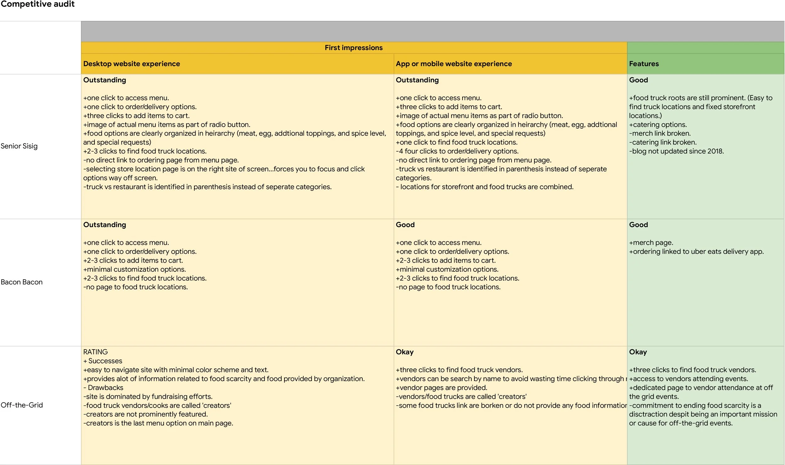
Through a competitive audit I identified several local food truck vendors that utilized apps or desktop sites to support their business. This Identified several areas where my food truck app adds value for the user in the following ways: (1) None of the competitors have a dedicated app for ordering food. The vendors rely on separate third party apps for placing orders on the desktop and a phone. Consolidating ordering to within the app may allow the user to save time. (2) Desktop apps limited access for users to merchandise or catering. A mobile app with a menu that can change or provide customer reviews can supplement the ordering experience. (3) Several of the vendors provide limited information about their location or post a regular schedule for loyal customers to follow. Adding a vendors profile or social engagement features may allow users to find and track their favorite trucks and dishes after an event .
After I completed the competitive audit and identified gaps and opportunities of competitors. I utilized the information to develop user a user journey map and develop an initial series of questions for usability testing . A primary user group identified through research was working adults who seek out food truck events or enjoy happy hour food along with cocktails after work.
This user group and my research revealed that there is no single way to track food trucks and support a vendor beyond seeing the trucks at events. The search for a previously enjoyed food truck vendor can be a big time sink at events or require more energy and time to plan which can be a distraction from the music and fun atmosphere of food truck events or festivals vendors may attend.
'does this give me the ability to order from different carts.'
'food trucks are crazy. this pop-up window should include a summary of what i order.'
'most people walk around and develop a menu with items from multiple food truck...fries from that one, chicken from that one' 'is is sorted by fook truck?'
'what food trucks are going to be there' 'whats the entertainment?' juggling vs music. time of day and then location.' 'recommend options for calendar updates and notify.
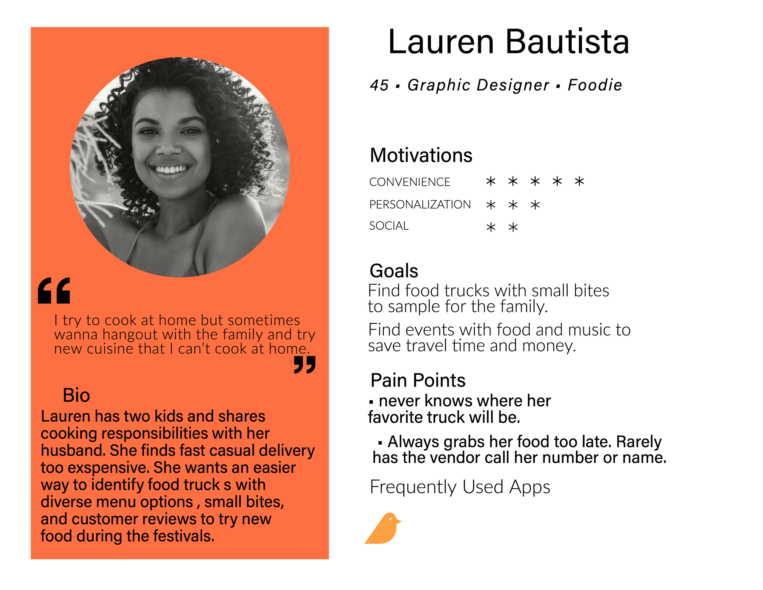
Personas:
I conducted several interviews and empathy maps to understand the users I’m
designing for and their needs. A primary user group identified through research
was working adults who seek out food truck events or enjoy happy hour food along with cocktails after work.

This user group and my research revealed that there is no single way to track food trucks and support a vendor beyond seeing the trucks at events. The search for a previously enjoyed food truck vendor can be a big time sink at events or require more energy and time to plan which can be a distraction from the music and fun atmosphere of food truck events or festivals vendors may attend.
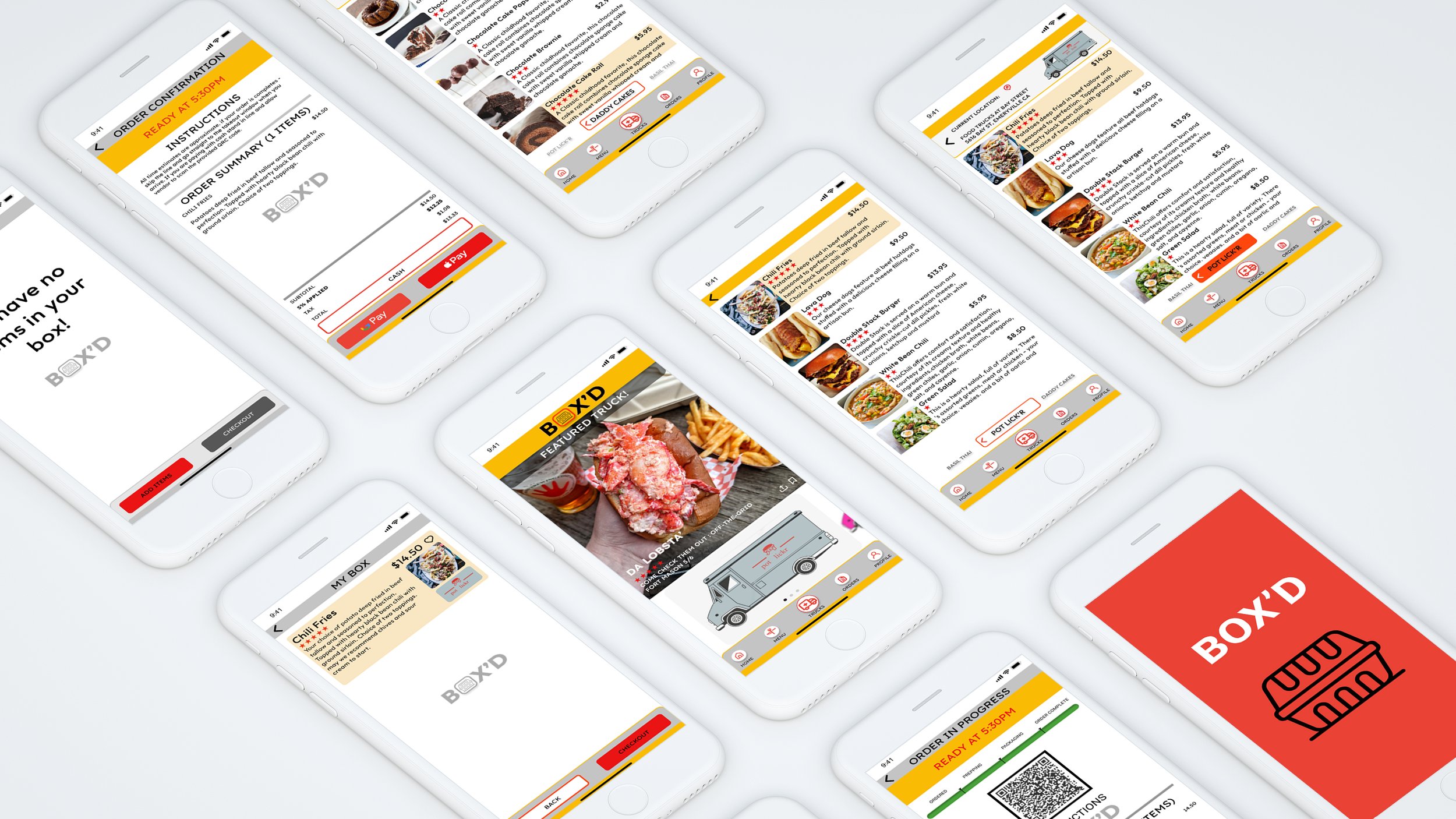
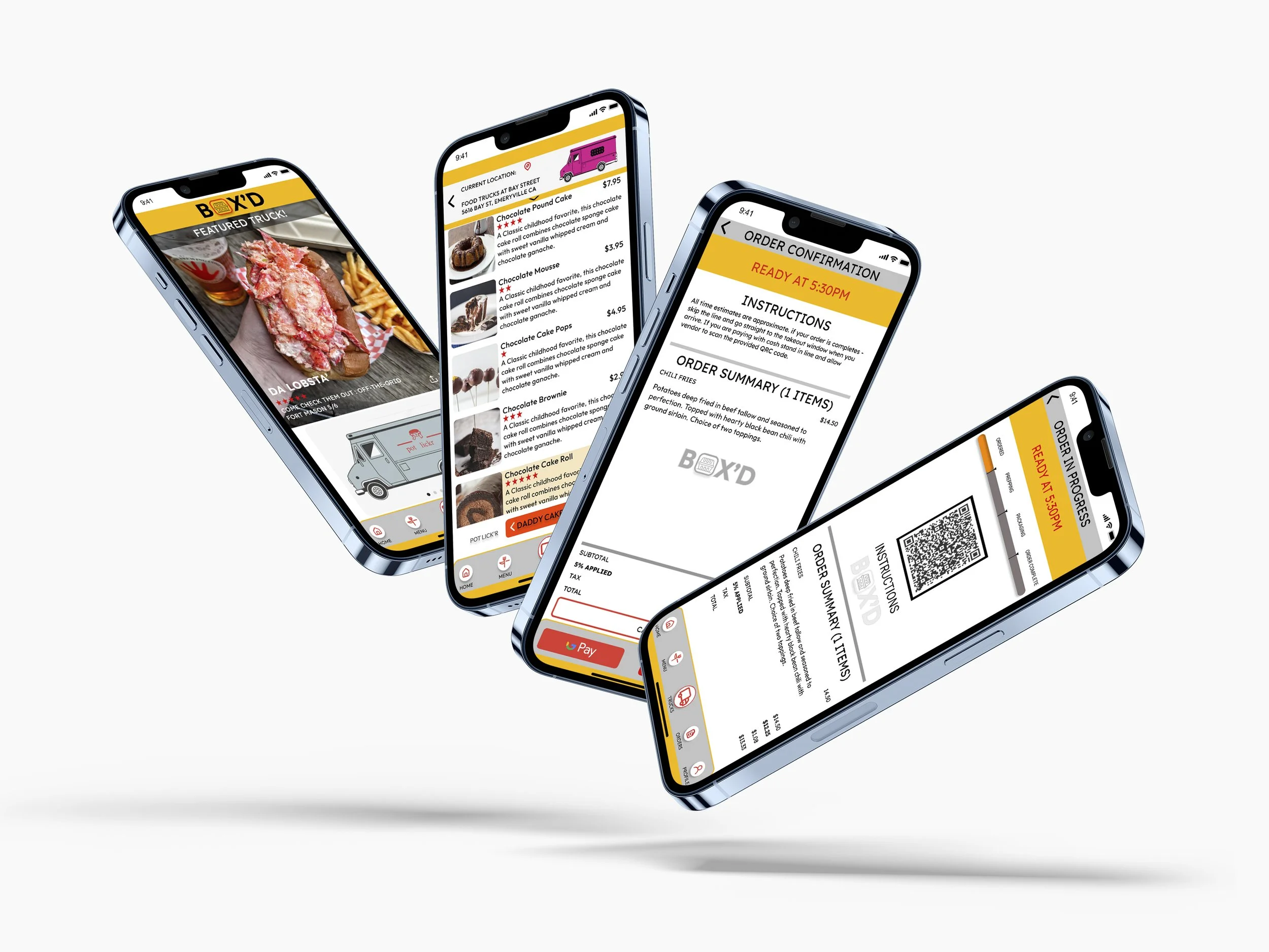
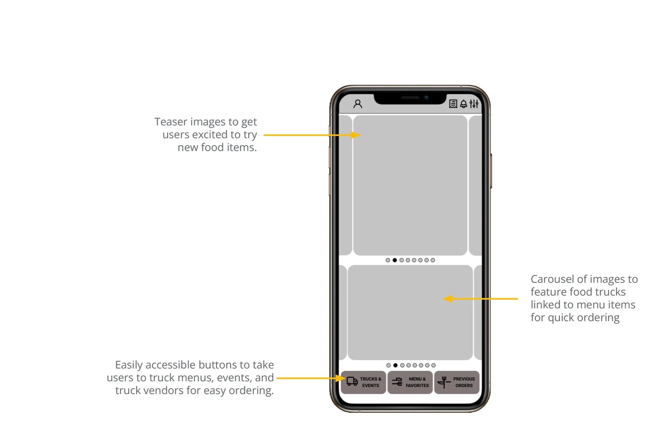
Wireframes
-
SEARCH
Homepage presents the user with a large image of featured food or food truck vendors. The user can swipe between two photo carousels that link to a food truck vendors menu.
-
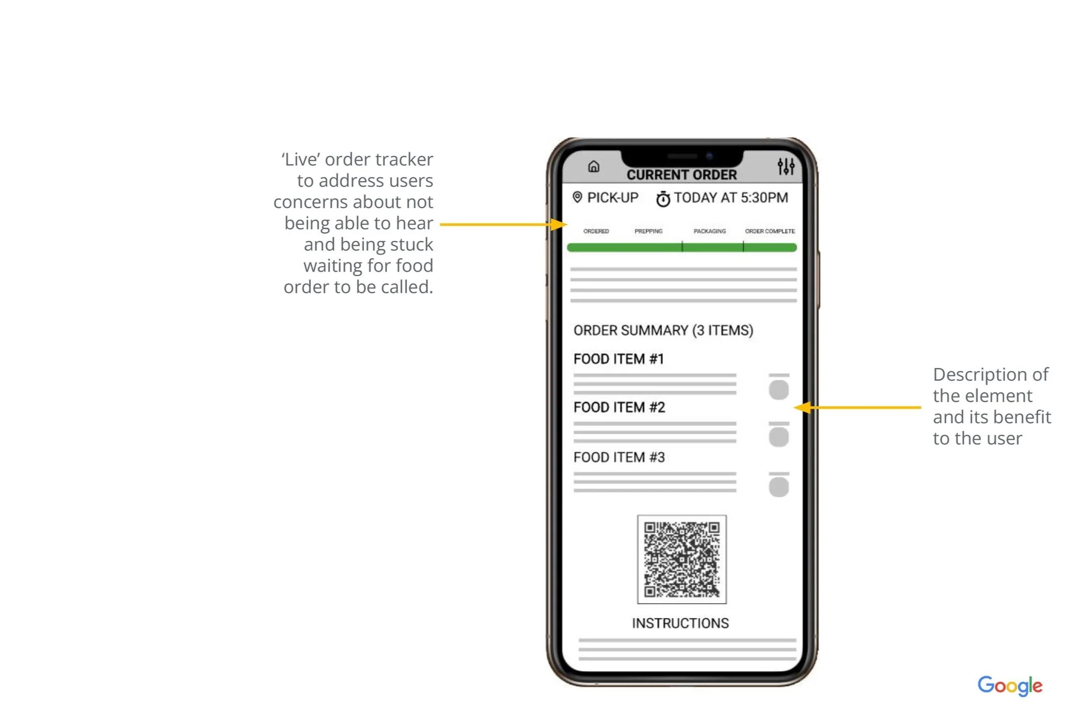
ORDER
Users can see a photo of food items and brief description with prices. With a click users are taken to a longer summary and bigger image with customer ratings before adding an item to their cart.

-
CONFIRM
Once items are confirmed and paid for. The user is presented with an order summary page with a QR code and item summary that notifies the user the order is complete, the vendor is notified of the order, and a notification will alert the user that the vendors has their order ready.
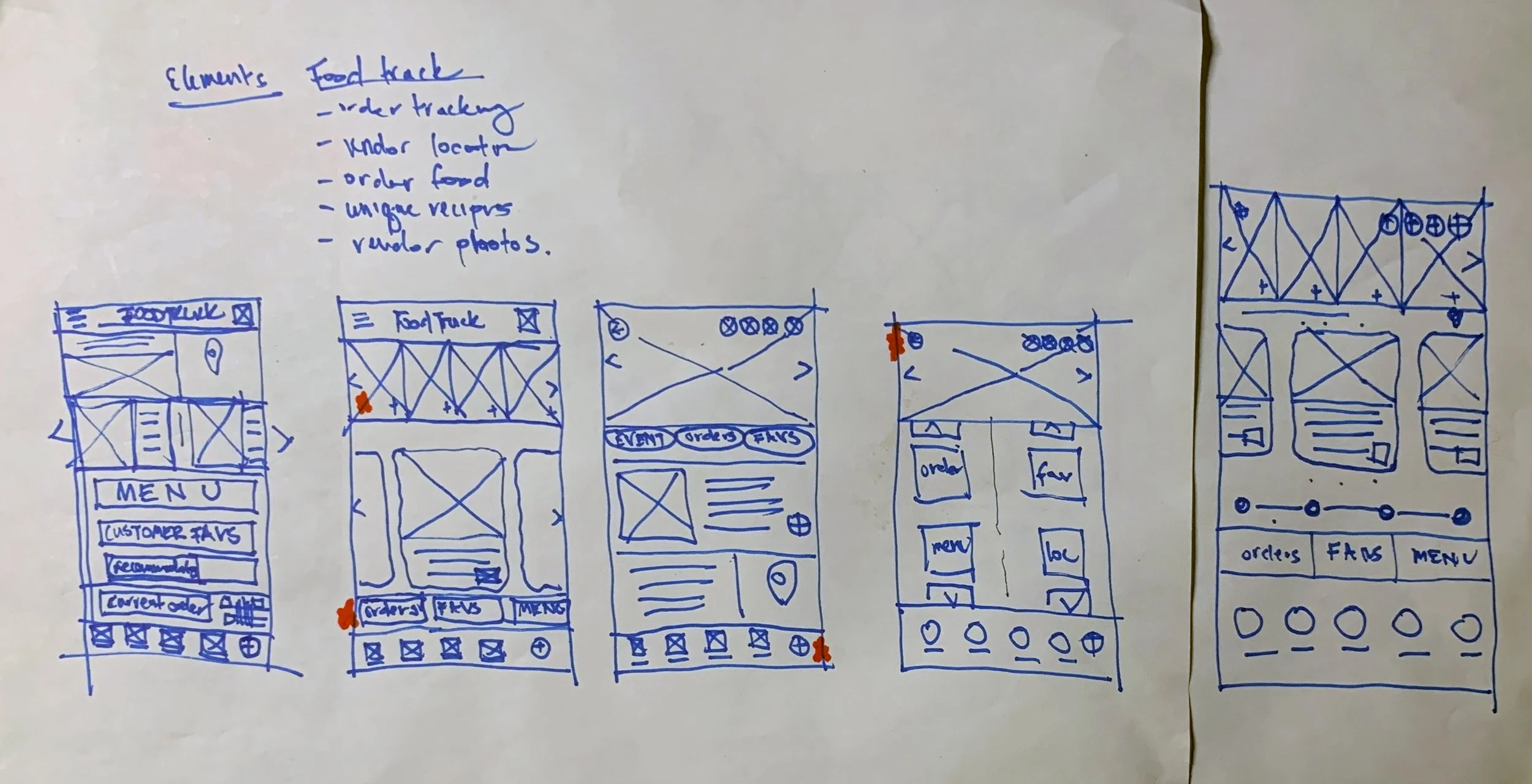
Low Fidelity Prototype

https://www.figma.com/proto/JrlfwAIhV6MDnnR3kdaSgv/GOOGLE---UX---FOOD-TRUCK-DIGITAL-WIREFRAME-ASSIGNMENT-R.2?page-id=0%3A1&node-id=358%3A2678&viewport=404%2C48%2C0.5&scaling=scale-down&starting-point-node-id=358%3A2313&show-proto-sidebar=1
KEY INSIGHTS
-
Security
Paying for food and receiving confirmation of orders is inconsistent and doesn’t feel secure.

-
Time
Searching for the ‘right’ food truck is a distraction from friends and family.

-
Share
No single platform to keep track or ‘bookmark’ visited trucks to visit again or share with friends.
-
Accessibility
It can be hard to hear orders called, and receive notifications when orders are ready.

KEY FEATURES
-
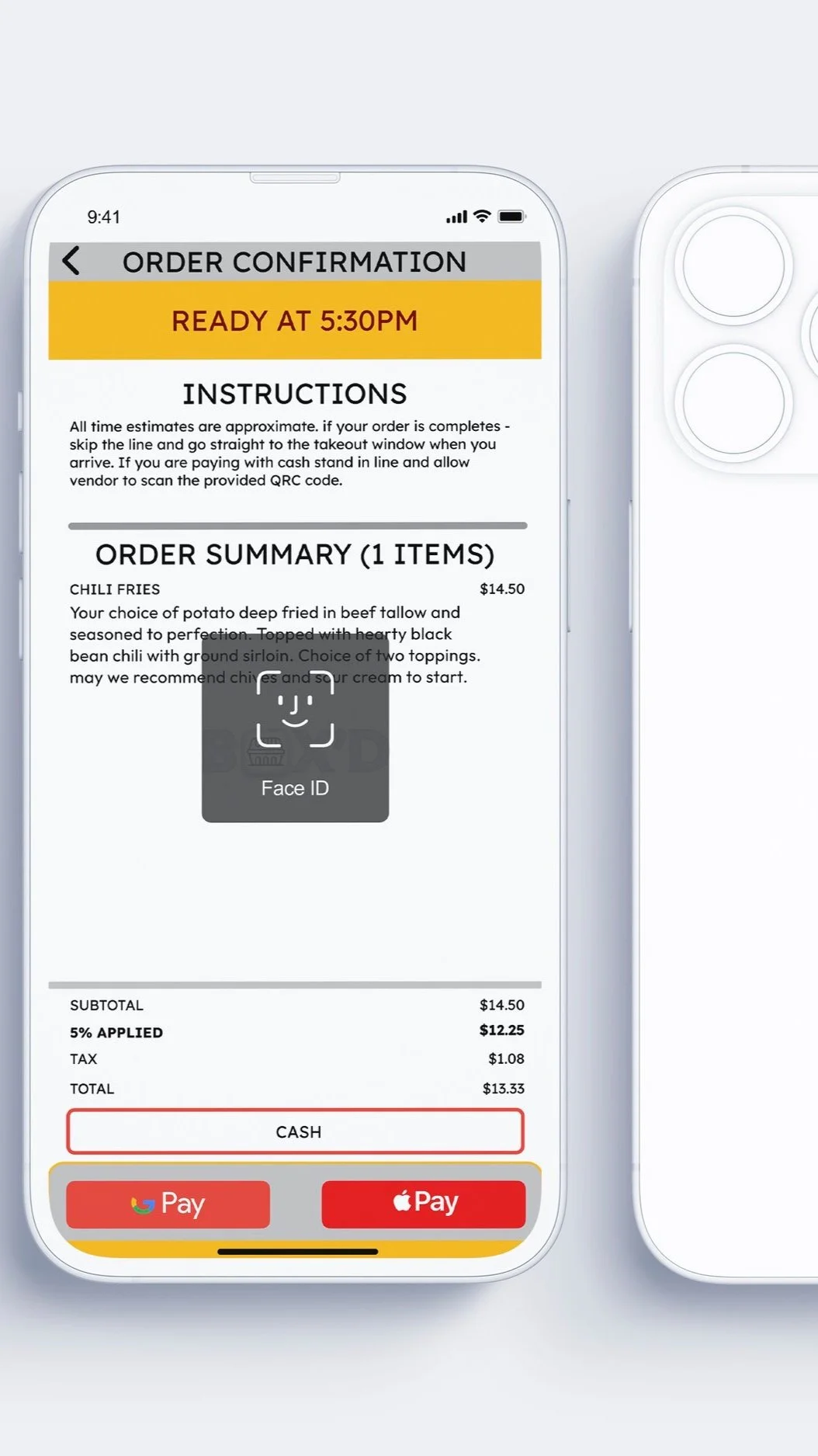
Security
Pay for food securely with contactless payment. An order summary is provided for the user to confirm all selections and verify cost of items.
-

Time
Search through multiple food trucks and their menus with a swipe. Consolidating multiple menus in one place reduces distractions at food truck events.
-

Share
Share truck information with friends and family or favorite your vendors for future orders.
-

Accessibility
Visual Notifications, sounds, vibration can be utilized for notifications when orders are complete and ready for pickup.
https://www.figma.com/proto/JrlfwAIhV6MDnnR3kdaSgv/GOOGLE---UX---FOOD-TRUCK-DIGITAL-WIREFRAME-ASSIGNMENT-R.2?page-id=607%3A11019&node-id=607%3A11019&viewport=404%2C48%2C1&scaling=scale-down&starting-point-node-id=607%3A11256&show-proto-sidebar=1
Impact:
The BOX’D app is a convenient and secure way to track all of great food, fun street venues, and plan a reliable engagement with food truck culture.
“This app is so cool! It feels real. If I used social media or apps more often I would definitely add this one to my phone!”
What I learned:
While designing the BOX’d App, I learned the value of iterative design thinking and affinity diagramming. Through those exercises I was able to identity user needs and separate my own design biases from what is needed for a functional product that reflects the needs of the user. I also really enjoyed the peer feedback to refine each iteration of the app for a stronger product.
Next steps:
Conduct a final round of usability studies to determine if final feedback from users is adequate.
Develop a clearer design system that outlines all of the colors, typography, FIGMA components and visual hierarchy for the final product.
Develop diagrams to identify the complete UI architecture after addressing user feedback.