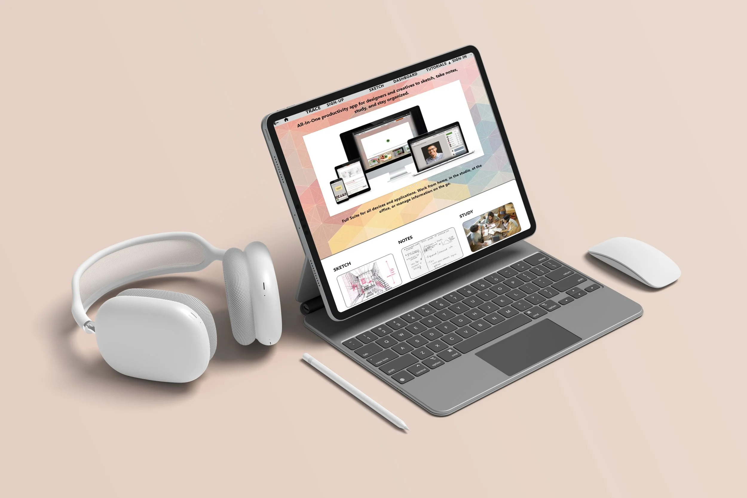
TRACE
Note-taking app for students that want a quick and efficient way to take notes and sketch for online lectures.
I conducted user interview and developed empathy maps to identify my user ( architecture students) and their needs. I discovered that several users struggled to organize digital documentation of lectures with hand drawn sketches or notes. Consolidating the different capture techniques involved too many different types of software to merge documents and wasted precious time taking away their focus on production in design studio.
-
Note taking apps do not include enough digital tools to create useful notes or consolidate information for collaborating with other students.
-
UX designer developing an app concept for a note taking app for an online architecture course
-
Design a note taking website that includes digital sketch tools and tag important notes to track digital notes to share and study with other students.
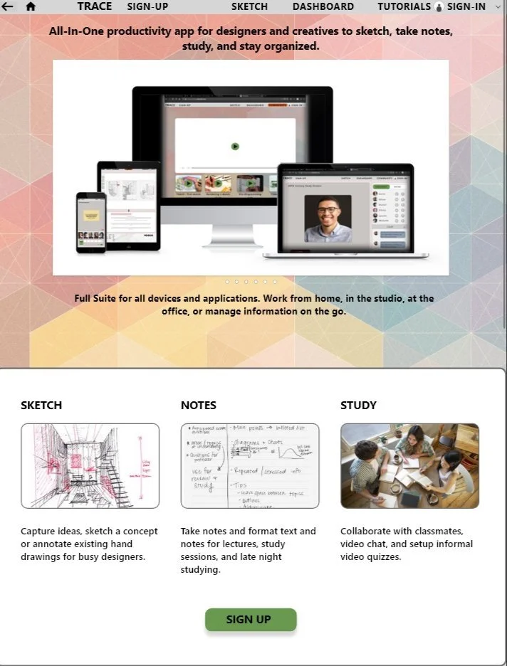
Scalable, flexible, consolidated desktop and mobile app for note taking and collaborating for Architecture students.
Research:
-
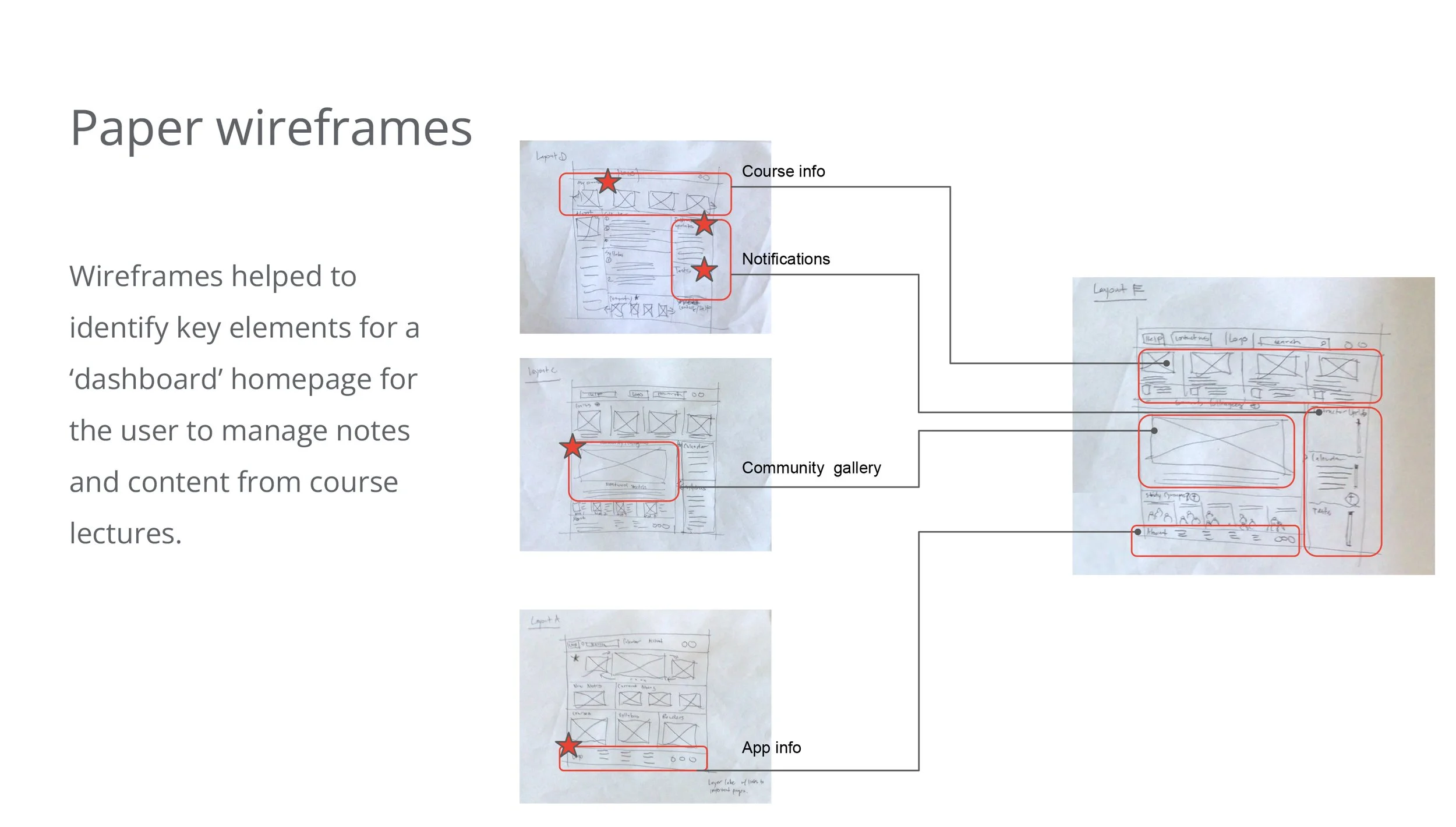
Initial sketches, crazy eights, and layouts
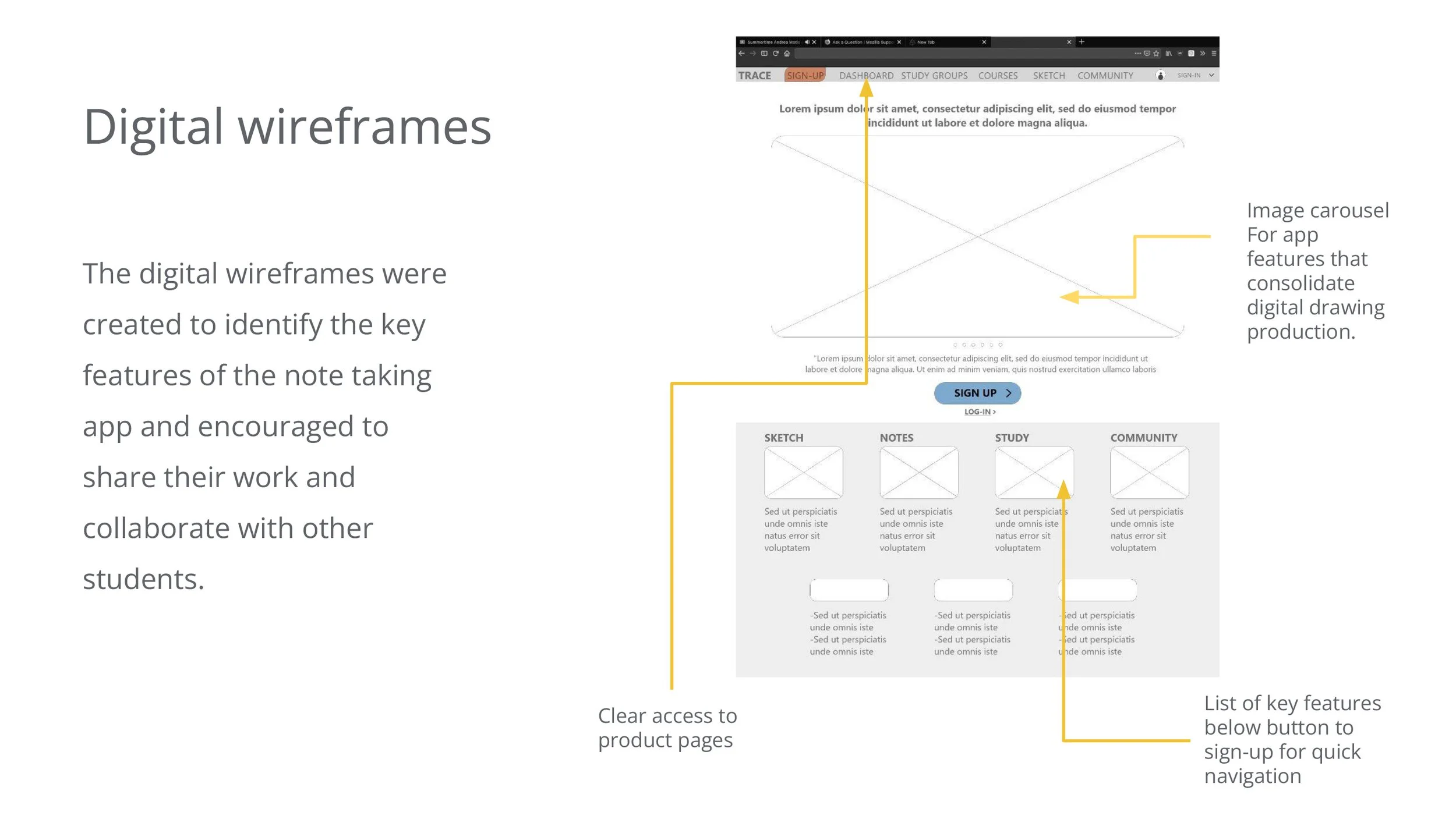
Initial Wireframes developed and refined from Desktop site map. Initial Sitemap included flow navigation for course, professors, account management, syllabus, and class reader storage. However, user feedback refocused the effort to offer features that enhance studying, drawing, and sharing content with colleagues.
-

Navigation Flow and early framework
Initial Wireframes developed and refined from Desktop site map. Initial Sitemap included flow navigation for course, professors, account management, syllabus, and class reader storage. However, user feedback refocused the effort to offer features that enhance studying, drawing, and sharing content with colleagues.
-
Initial sketches, crazy eights, and layouts
Initial Wireframes developed and refined from Desktop site map. Initial Sitemap included flow navigation for course, professors, account management, syllabus, and class reader storage. However, user feedback refocused the effort to offer features that enhance studying, drawing, and sharing content with colleagues.
-
Navigation Flow and early framework
Initial Wireframes developed and refined from Desktop site map. Initial Sitemap included flow navigation for course, professors, account management, syllabus, and class reader storage. However, user feedback refocused the effort to offer features that enhance studying, drawing, and sharing content with colleagues.
I conducted user interview and developed empathy maps to identify my user ( architecture students) and their needs. I discovered that several users struggled to organize digital documentation of lectures with hand drawn sketches or notes. Consolidating the different capture techniques involved too many different types of software to merge documents and wasted precious time taking away their focus on production in design studio.

‘It always take so much time to develop digital notes…flipping through multiple programs is frustrating…’
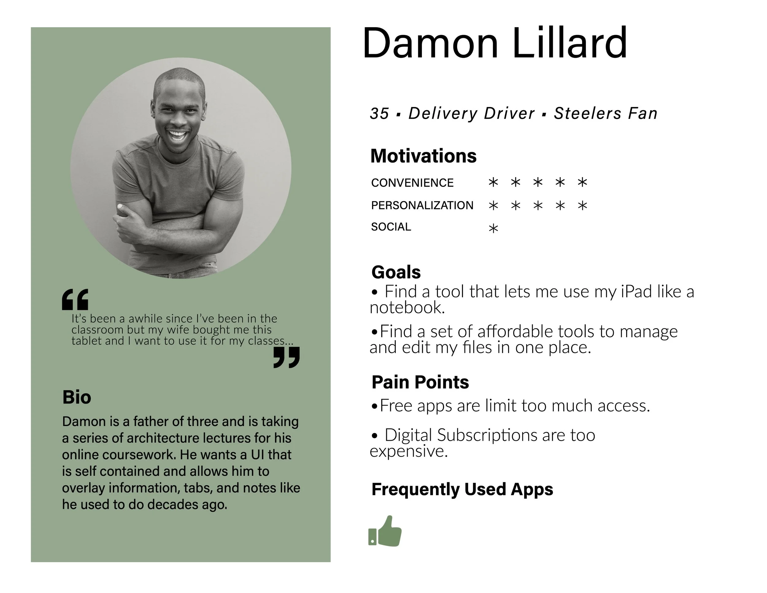
Personas:

Wireframes
-
Early Layouts
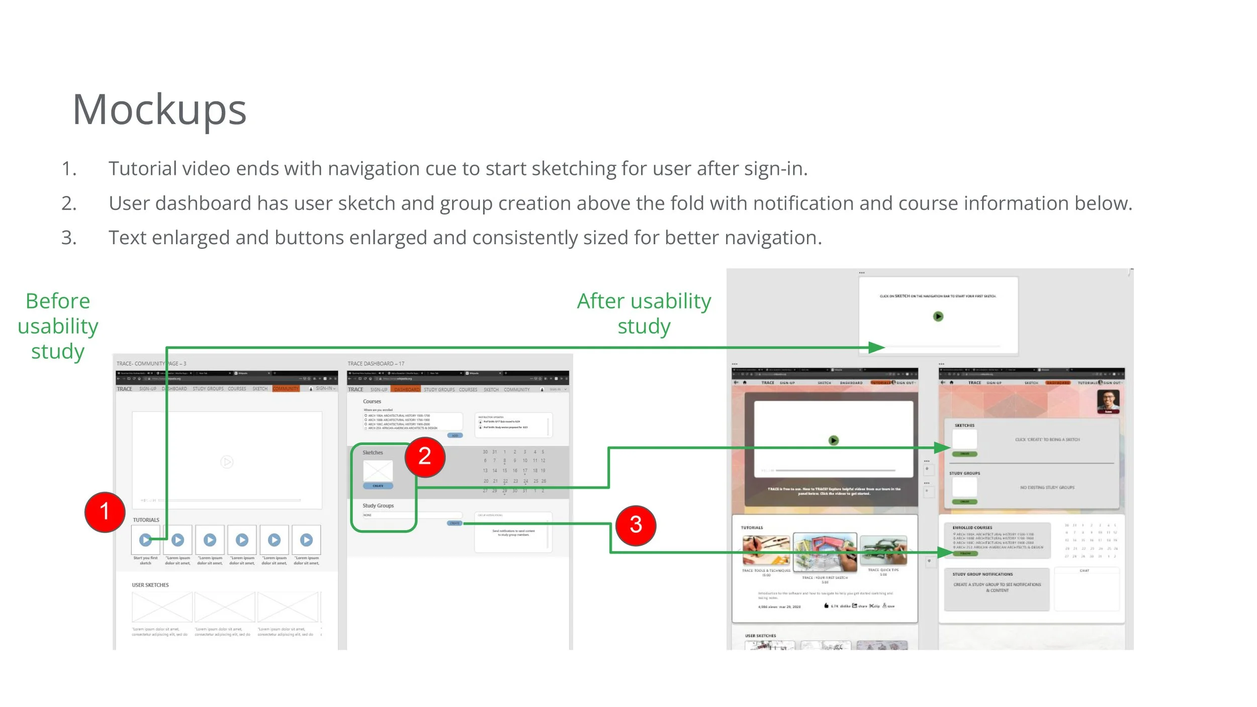
Initial wireframes were developed from initial sitemap layouts. Users were asked to sign-up for the app, add courses, and create a sketch.
-
Initial Prototype and feedback
User feedback help to simplify Desktop homepage and only provide the essentials to (1) sign-up, add classes, create drawings, develop study groups, and allow video conferencing with digital flashcards.
-

Sign in
Users wanted more inviting layout for initial sign-up - a way to show features of the App before using the tools.
-
On Boarding
Users like the Dashboard concept to track sketches and classes, but there was no clear navigation path for a users initial exploration.
KEY INSIGHTS
-
Collaboration
Students want to be able to share information with their peers without resorting to thirdparty apps or email.

-
Coordinate
Students want to create study groups to share notes and create digital study groups.

-
Study
Students want ways to use the notes they’ve taken to study with ‘digital flashcards’ or quiz each other.

KEY FEATURES

STUDY
Users can free sketch free hand, or insert images and mark up images or text, any typed text can be selected and used to create flashcards for studying at a later time. The digital tool bar allows users to develop sketches beyond paper, pen or pencil sketch.

COLLABORATE
Users want a way to share created content with others. Feedback included offering a way share notes or information with users through digital flashcards or an option through video chat to quiz each other and share information.

COORDINATE
Add classmates or friends for group study and information sharing - using Trace as a dashboard to share and track information.

HAVE FUN
Create a deck of flashcards - share and test other classmates from your own flashcard deck based on your own notes taken from the sketch feature or text.
-
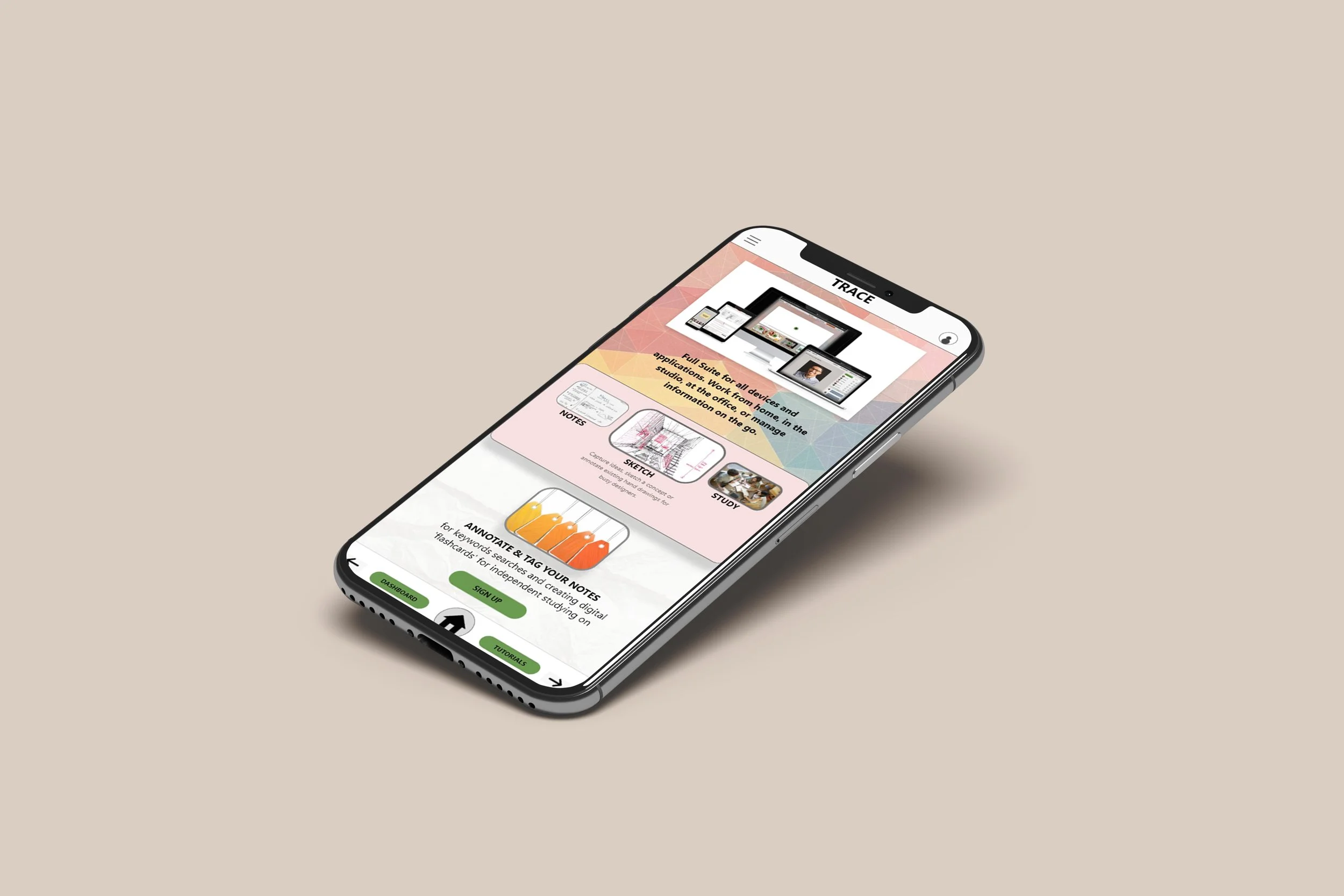
Mobile
Use TRACE to communicate with colleagues and track class notifications.
-

Desktop
Use the app on your tablet for sketches and notes. Join a group study session and study with colleagues and share research or information for presentations, tests, or study sessions.
Impact:
Users enjoyed the idea of a note taking app that focused on collaboration and socializing with colleagues while organizing and cataloguing information to share and study beyond taking notes for a lecture.
“Nice…”
What I learned:
I learned that usability studies and user research can be an impactful tool that improves on the user experience when thoughtfully considered and carefully applied to any design iterations to achieve a fun and engaging product.
Next steps:
Conduct a final round of usability studies to determine if final feedback from users is adequate.
Assess the desktop mockups for accessibility and conduct a color contrast test for enhanced legibility of all product elements.
Develop prototype for tablet and conduct user feedback.